Too Many Requests from Your Network
Please complete verification to access this content.
It’s 2018 — and humans are demanding visual communication. We scour Instagram stories.
We crave videos and short films. We engage with images.
We yearn to see the world through a series of stills or moving screenshots.
According to Forbes, Planet Earth spends a billion hours on Youtube every day, and 91% of buyers have a preference for visual content (as opposed to traditional text-based content).
Clearly, the desire for visuals is engrained in our nature — and that’s only increasing.
Forbes notes that Cisco predicts 80% of consumer internet traffic will be video by 2020.
That’s a staggering percentage, and all signs lead to the idea that the often underestimated form of visual communication will refuse to stand in the shadows of its more traditional text counterpart.
But why is it so important, anyway?
Let’s take a deeper dive into the incredible realm of observable optics and how visuals play a massive (and ever-growing) role in marketing.
1. Visual Communication It saves time
Visual communication saves time. And in a society where we are looking for information that is easily understandable and ready to be absorbed — this is key.
As eztalks states, “It is easier to process a visual signal quickly than to read a sentence of a paragraph full of text.”
They further describe that images are able to pass an immense amount of information in a short span of time.
Our brains, in fact, are said to process images a whopping 60,000 times faster than text.
When you’re using visuals as a form of communication, your message can be conveyed quickly and effectively — saving customers valuable time in the long run.
2. Visual Communication Makes an Impression
Just as nonverbal communication makes a significant impact when you’re meeting someone for the first time — so, too, does visual communication in the realm of marketing’s first impressions.
Consider graphs, photos, and videos –– your facial expressions and body signals.
Potential customers are on the hunt to analyze and assess.
Should I buy this product? Should I make this investment? Should I return to this website? Should I and why should I?
Utilizing visuals grants you the ability to entertain, engage and inform your audience.
It makes an impression through its use of colors, textures, typography, data visualization and more.
3. It Supports Your Message
If you’re looking to share an idea or a message, consider visual communication your very dear (and highly expressive) friend.
Alex Chung, CEO of Giphy — the online database that allows users to search for and share GIFS — stated, “a picture paints a thousand words…by that logic…the average GIF contains sixty frames, then they’re capable of conveying 60,000 words — the same as the average novel.”
You can snap a photo of your daughter holding on to an ice cream cone from the food truck you’ve just launched, for example.
She’s smiling. There’s mint chip spread across her cheeks.
She’s ecstatic.
And in that moment, you’re able to bring your viewers into your world of bliss.
Throw a creative filter on the image that conveys a bright and happy feeling — and you’ve just created a visual representation that conveys your image.
Your food truck is for families.
It will enhance their lives and make all their ice cream eating daydreams come true.
Your message is supported.
Your viewer trusts that message, but is also entertained by it.
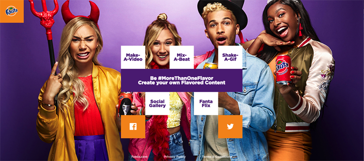
Fanta’s primary audience is meant to be youth; so it’s known for colorful advertising
4. Visuals Builds Identity
Visuals help viewers to remember and help you to build a consistent visual identity.
Words are a powerful tool, indeed, though visuals are the elements that get ingrained in your customer’s mind.
Consider a company like BMW, for example, with its iconic logo of blue, black and white that rests in a circle with three letters.
Or McDonald’s, with those golden arches.
Ikea, with its royal blue and mustard yellow.
Starbucks and the symbolic green siren that finds her way from the sea and onto cups everywhere.
At the core, visuals are what we use to associate with brands.
Like newborn twins wearing different colored onesies for the fresh and frightened parents, it’s how we tell one apart from the other.
It builds an identity –– and a strong one at that.
5. It influences emotion.
An image of a Christmas tree with twinkling lights. A video of a family reunion at the airport.
A graph showing the amount of food that gets wasted every year.
What do all these things have in common? They make you feel something.
Visuals elicit emotion, and it comes as no surprise that consumers let emotion influence their buying decisions.
Perhaps the first example of the Christmas tree is used for a boutique shop that sells handmade artisan ornaments.
The second is used to sell airline tickets.
The third is for a grocery store that specializes in food that would have otherwise been thrown away.
Visuals engage your consumers and urge them to become interested in your product, your business, or your services.
It gives you a story, and that story –– is what brings about emotion.
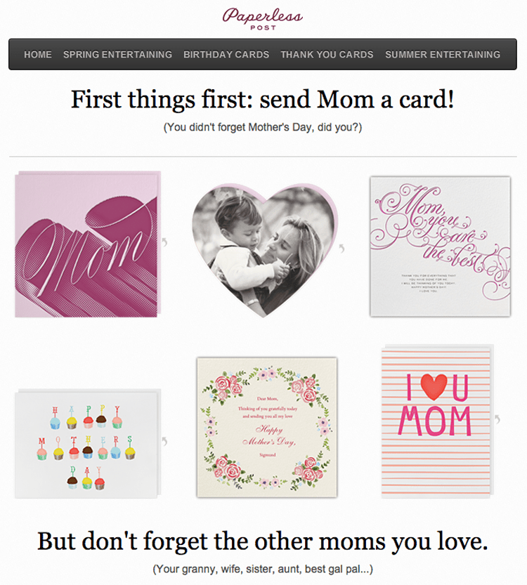
One of the best email campaigns according to Hubspot – from Paperless Post – makes you think and feel
So, if these are the things visual communication does, how do we implement it? In many ways…
1. Visuals in Web design
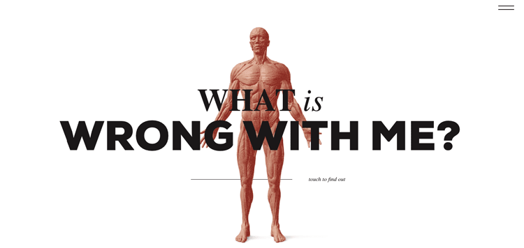
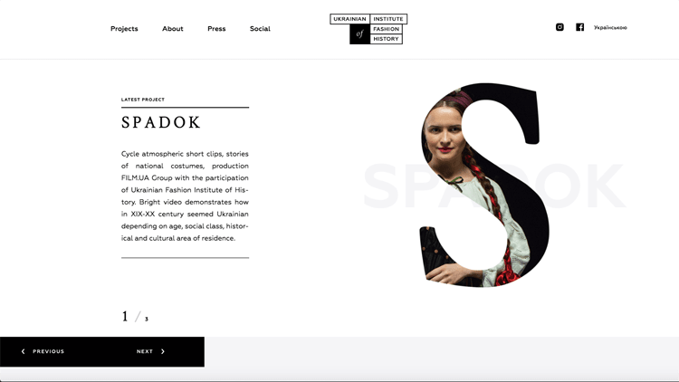
In web design, you’re given the perfect opportunity to convey information about yourself and your brand through visuals.
A website can be both visually attractive as well as visually engaging.
It’s the well-balanced and excellent execution of these two elements existing in harmony that will encourage your customers and viewers to return again.
Think of what particular web design elements speak to you and move from there.
They can be minimal, feminine, colorful, anything you want them to be.
Whether you’re making an e-commerce site, a personal blog, or a portfolio site, the thematic choice is yours — and if you give that theme and design meaning, it will make an impact on your viewer’s impression.
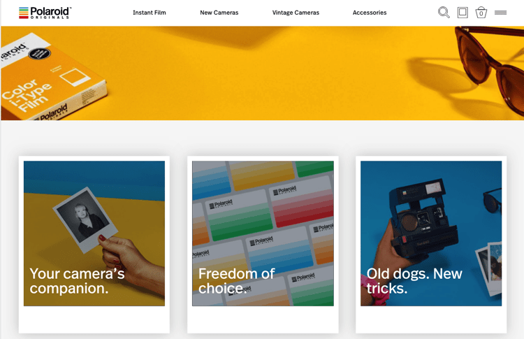
For example, how Polaroid used their photo templates in website design
2. Visual Content
Once you have a platform, you have the ability to share content. Whether that’s in the form of a running blog on your website, posts to your social media outlets, or mini magazines you print every quarter with news about your businesses latest projects — visual content grants you the ability to share and be heard.
Take photos. Capture videos. Share things from others that spark ideas, and watch your content come alive.
If you feel like you need some content creation inspiration, read this article that covers everything from Twitter lists to Pinterest boards and beyond.
3. Visual Advertisements
So you’re running a sale on your digital strategy services next month?
Excellent! When you make your ad, consider enhancing your message with visuals.
Figure out how to integrate what you’re offering with a visual that represents that.
You can do so subtly or more explicitly — though chances are, doing so will help those visually-inclined customers be more intrigued with what you’re offering.
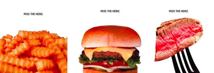
Take the fictional character Don Draper from Mad Men, for example, whose visually daring “Pass the Heinz” pitch from 50 years ago was accepted in 2017 for billboards in NYC, published on the New York Post and Variety, as well as supported across social media channels. Now that is the powerful (and generational) synergy between ads and images.
4. Visuals in Emails
Email newsletters are fast and effective, and if they’re created with visuals in mind, their life will be extended (and a trip to the trash, though it may be inevitable, will at least be put off for a while).
As customers meander through their inbox in a fit of deleting, invite them to pause once they click on your message.
Keep their interest with visuals. Perhaps there’s a graph to share, a photo to send, or video to attach. Give your email meaning and make it last.
For extra tips on optimizing your email template for better engagement.
5. Visual Typography
Typography is an incredible design resource and art technique to use in marketing.
Through things like size, typeface, length, line spacing and more — typography impacts how potential customers may perceive your product, brand, or service. If you’re looking to share a message that’s text-based (a slogan, a poem, a brand name), utilizing creative typography is a wildly effective tool.
Think of the red text of Coca-Cola or those famous multi-colored Google letters.
Typographer Olivier Gourvat said, “My approach is to conceive and create each letter as if it were a logo.”
Whether you’re using a computer program or creating handmade fonts — make each sentence (and each letter) count.
So, if these are the ways we implement visual communication, what are some tips for doing so? Here are a few…
1. Enhance the User Experience.
When it comes to marketing, visuals give you the chance to create user experiences for your viewers and potential customers that are entirely your own.
There’s a reason why we sit down and watch feature films or flip through old family photo albums — visuals have the power to pull us into a world, to entertain and engage.
Make the experience interactive with supporting texts, graphs, and a bit of humor.
Don’t ask or demand too much of your viewers.
Remember, they’re already here for you.
Now is your chance to make their experience positive and inspiring — so that they can connect with you and your brand.
2. Go for Quality.
We all know the phrase quality over quantity, and this is especially pertinent when it comes to visual communication.
After all, who wants to look at blurry images or videos that were simply thrown together last minute?
When you’re asking someone to engage with your content on a visual level, do them a favor: put in the effort and make it great.
Give them an end result that shines, and they’ll be more enthusiastic and eager to share your work, your story, and your product.
3. Build a Visual Narrative.
One of the most significant elements of visual communication is storytelling.
Stories unfold in the types of coffee we drink, the shoes we wear, the toys we choose to bring to a birthday party, the websites we create and the businesses we start.
In crafting a story with your visuals, you build a narrative.
Doing so encourages your viewers to connect and return again in the future.
It gives your brand life and purpose.
4. Optimize your Images for Search.
To make the most out of the images you create and share, make sure to optimize them for search purposes.
Image optimization will draw more people to your site and eventually, get your brand out there.
Use original, high-quality images. Watch the copyright.
Add captions and file names. Consider the format (GIF, JPEG, PNG). Make sure the file size doesn’t account for slow loading times on your site (without losing quality), and you’ll be good to go.
For more information, take a look at these
5. Get Creative with Edits.
One of the best ways to easily enhance your images is to get creative with basic edits.
Whether you’re using original images or stock images, edits can reinvent photos. They can give pictures a vintage vibe, a saturated and vibrant feel, or lighten up an otherwise dark scene.
If you’re not confident with Photoshop, try software like Luminar that produces professional-looking end results (regardless of your skill level) or go for free software like GIMP.
Getting creative with your edits is a fun and simple way to jazz up less-than-extraordinary photos and engage your customers with more professional and appealing visuals.
Utilizing visuals in marketing builds a strong identity for you and your brand.
It makes an impression, supports your message, and enhances user experience in everything from emails to web design.
The world as we know it is constantly and consistently becoming more visually-inclined— and being a part of it all is important and exciting, too.
Start integrating visuals today for a creative and compelling way to draw your audience in and keep them interested.
Good luck on all things visual — from photos, to videos, to illustrations and beyond!
Max Therry is an architecture student who is fond of photography and blogging. He recently started his own photography blog about photo editing, modern photo trends, and inspiration.

