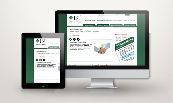
It’s a mobile-first world in B2B and B2C industries alike. If your website isn’t optimized for web – you could be missing a huge potential outreach for your business.
In fact according to Search Engine Land, mobile now represents 65% of all digital media time. That’s more than half, yet many marketers still prioritize their desktop strategy.
Here’s how a responsive web design helps you get more business leads through your web presence made available across whatever device your users may be coming from.
When any company is developing a website they must constantly remind themselves that first impressions matter immensely. 38% of people stop engaging with a website just because the content or layout is unattractive.
Time is precious, and people don’t want to waste their time with something that isn’t appealing.
With the percentage of searches starting on mobile devices, a responsive web design that is optimized for multiple platform viewing is extremely important.
Imagine yourself on your tablet trying to view a link from an email only to have that website distorted and lacking any real structure.

Now, you could easily go back and check that same link on your personal desktop but the damage is already done and this site has left you with a bad taste in your mouth.
This is seen countless times, and many companies are losing potential business because of their inadequate website design.
Instead, responsive design focuses on the user experience across platforms, and ultimately generate business. A site that’s easy to navigate can be the make or break of a sale.
Here’s how responsive web design helps you generate a higher number of conversions from your traffic, generating more business leads.

What Is Responsive Web Design and How Does it Help?
- Website integrated with a fluid experience over multiple devices
- Optimization for SEO, traffic and overall user experience
- Demonstration of an active online presence
The first benefit of responsive web design is that people will have a seamless user experience on whatever device they enjoy using most.
Whether it is their mobile phone, a table or their desktop, you can expect that users will find the information they want without any disturbance in their user journey.
This comes to play in the user interface design, and it is also one of the most important elements of responsive design.
In today’s world, many people are using multiple devices, and while your site may have been created for a desktop, you cannot rule out access by smartphones or other devices.
According to Statista, there are roughly 207 million smartphone users and that number is to set to rise dramatically in the next few years. Search engines, such as Google, are also noting this rise and are setting up guidelines for websites to take in order to be included in mobile searches.
This willingness to change will be highly noted by Google and will also benefit your SEO. This will also generate traffic for your site and ultimately bring new leads.

All search engines want to see that you have a solid online presence and are considered an authority in your industry.
This is partly determined by the experience provided for the average user.
As important as it is to have a blog with bountiful content and an active role on multiple social media platforms, you have to assume that the first prospect users will click is your actual website.
In the past, many if not all websites were fairly difficult to navigate.
There were links that went nowhere, outdated content that was front and center and a lack of direct contact with the company.
Now, each of these elements must be clear and focused with the objective of guiding the user seamlessly through the ideal user journey. By updating and reformatting your site, you are telling users that you are committed to creating an experience that is streamlined and memorable.
This in turn will make them want to go back, refer you and bring in new leads.
Finding What Works
- See what other websites are doing
- Test out layouts and form placement
- Experiment with details
A great way to see what is working is by referencing some success stories in the user journey.
There is no shame in finding inspiration and many firms do this by simply viewing what others are doing. Find companies that are similar to yours and really dig deep into their sites.
Better yet, see what they are doing for mobile devices as well. You may be surprised by what you will find works and what you believe can be worked on.
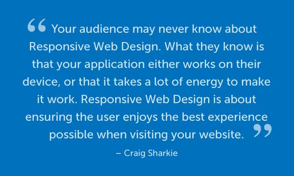
Industry experts Craig Sharkie and Andrew Fisher (authors of JumpStart Responsive Web Design) recommend using tools such as Responsinator to get an immediate view of how your website may look on various devices.

A cohesive, intuitive user experience (UX) also helps convert traffic to leads. From leveraging white space to using attractive calls to action, there are several areas that can be improved to increase your site’s return. Check out this guide from Hubspot with tips on how to improve your site’s UX.
After looking at what others are doing and reflecting on your own analytics, the next step is to create.
Check to see if all links are properly working and if there are any external links opening new tabs in your web browser. Keep in mind that a responsive web design should keep users on site in order to generate leads.
Responsinator and Google’s own PageSpeed are excellent tools to measure your web site’s responsiveness.
Benefits of Responsive Web Design
Statistics show these changes are necessary as a more streamlined website increases traffic, engagement, contact – and eventually leads. Having your website optimized for multiple channels allows users from desktop, mobile, and tablets to all experience a similar journey on site.
With the UX optimized on all platforms, a business can maximize the lead generation from each location potential buyers may be coming from.
Benefits from responsive web design include:
- Increased Traffic
- Increased Business Leads
- Increased Sales and Revenue
- Ideal, Quality User Experience
- Improved User Journey
- Brand Consistency Across Multi-platforms
- SEO Compatibility
- Higher Rank in Search Results (SERP)
- Cost Efficiency
- Ease of Site Management
- On-the-go Access
Google’s algorithms favor responsive websites. You can learn more about the update on Google’s blog.
With search being a leading source of organic traffic, it’s important to play ball with Google to get placed higher in search results (SERP).
A higher placement in the results for search keywords closely related to your industry has a direct correlation with increased traffic. Put simply by Moz, “the more traffic a site received, the higher it tended to rank.”
Higher targeted traffic increases potential business leads, and leads to conversion. Therefore, a higher SERP on targeted keywords will help you generate more leads, and a responsive web design is one way to help achieve that higher placement.

A responsive web design can bring the results you want, but first you must be willing to view your page critically and adapt to user trends. These are the first and lasting impressions for many, if not all, users that will come in contact with you and your brand.
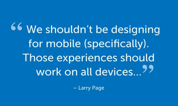
And while it is a mobile-first world, multi-device is the keyword of our user experience era. Just take it from Larry Page, Co-Founder of Google.

Customers can easily note passion, and they can detect laziness even quicker. Whether they were referred to you by someone or found you through a search engine, the very first impression of your company will be devotion or apathy.
Obtaining new leads may seem like a herculean task, but the path to new customers starts with creating a path that they can easily find and follow, no matter the device they’re coming from.
Edward is the writer and digital analyst at Digital marketing agency Aumcore. He helps business owners improve website visibility on mobile devices and increase conversion rates through Mobile SEO strategy.

