
Did you know that the attention span of the average human being is shorter than that of a goldfish?
It’s gone down from 12 seconds to 8 seconds, thanks to an increasingly digitalized lifestyle led by the average human being.
This is why marketers have come to rely on infographics, a fusion between visual and text, as a technique to retain consumers’ dwindling attention.
Infographics are not only good at engaging the audience, but also an excellent tool to increase brand visibility.

Following are the crucial steps a successful infographic marketing campaign is made up of:
Choosing a topic for the infographic
It should not be just another topic.
Your main concern when selecting a topic for your infographic should be to figure out whether it is relevant to your brand and provides value to your target audience.
Secondarily, you need to make sure that it is a timely, if not trending, topic among your customers.
Surveys, research, and the news are great sources to build your infographic around.
And with the help of Google News, Google Scholar, Buzzsumo, Facebook Trending, Twitter, Reddit, Quora, or popular blogs like Mashable, you can find a suitable topic that is currently trending among your target audience.
While doing your research around the topic, make sure that an infographic on it is not already out there, for repetition reduces value.
Unless you are able to approach the very same topic from a unique angle and you have confidence that your creation is going to be superior to what is out there, it’s better to lay off what’s already shared.
Once you have finalized the topic, and before you decide on the content, choose the type of infographic you are going to create.
There are several types of infographics out there and each has their own unique structure and features.
Example of a timeline infographic

- Timeline infographics: illustrates how a certain subject has evolved over time
- Comparison infographics: shows the comparison between two different subjects
- Instructional infographics: provides instructions necessary to complete a task
- List infographics: lists down information on a certain subject (consists mostly of text)
- Mixed-chart infographics: depicts data through different types of charts
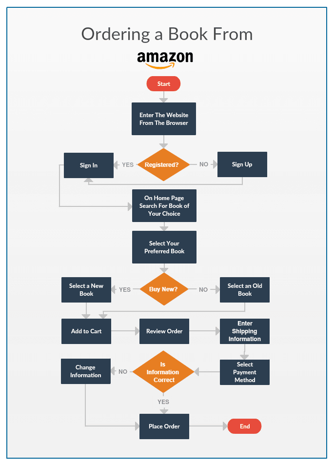
- Flowcharts: visualizes the sequence of steps in a process
Example of a flowchart infographic
With the style of your infographic on mind, it would be easier to filter and select the exact information you want to convey with your infographic.
Selecting information for the infographic
While it’s of utmost importance to make sure that your sources (which you need to cite at the end of your infographic) are credible and widely accepted among your target audience, not everything in a report, survey, or article can be placed in your infographic.
There are a number of things you need to keep an eye out for when hand-picking information for your infographic:
- At least 80% of the information you choose either needs to be converted into visuals or reinforced with visuals in the infographic.
Therefore, always find types of information that give you the opportunity for visualization. These could be stats, comparisons, processes, anatomy, hierarchy, etc. - Not only should the information you place in your infographic be stimulating, engaging, and digestible, but together, they should relate a story to the reader.
The attention span of the audience is limited, and they are always looking for a reason to check out.
And an infographic with too much text will do exactly that. While you should not cram your infographic with text, you need to keep it visually appealing.
Always simplify your story with visuals, but visuals should be clear and relevant. - The text you decide to place in juxtaposition to the visuals should be simple, supportive of the narrative, and consists of not more than a sentence or two at once.
Drafting the infographic narrative
When finally putting together the information you have selected to create a narrative, you need to focus on 3 things:
- Target audience
- Objective of the infographic
- Subject matter of the story
The parts (shown below) of your narrative should always reinforce these 3 elements.
- Title and subtitles. These play a key role in grabbing the attention of the readers. Your main title should not only awaken the curiosity of the reader, but it should also be relevant to the subject matter of the infographic.
And subtitles should equally be punchy and aptly support and summarize the details they follow. - Introduction. The introduction of an infographic should not be as lengthy as that of a blog post.
It should set the tone for the story you are going to narrate and help the reader get an idea as to what the rest of the infographic is going to deliver.
It’s better to start with a shocking fact or a stat that would immediately get the attention of the reader.
Limit this to 3-4 sentences or try to relay your message with graphics. - Body. This should include more visuals, and any accompanied text should reinforce the idea behind them and be concise at the same time.
This could be made up of several sections that include the supportive stats depicted through charts, quotes, facts, etc.
Your biggest concern here should be to make sure that the narrative flows from section to section and point to point smoothly without confusing the reader. - Conclusion. Not all types of infographics have a separate section for the conclusion.
But in case you are adding a separate section for concluding remarks, keep it simple and make sure it is within 2-3 sentences.
Designing your infographic
It’s not wise to directly jump into designing your infographic without an initial idea of its layout. The design should not only be aesthetically appealing, but it should be easily understood by the reader.
- Wireframe. The wireframe is basically the skeleton of your infographic design.
It helps you arrange and map out the elements on your infographics to be more visually coherent.
At the same time, it helps you find flaws in the narrative or the date you have collected.
And with a wireframe, you can keep from redoing work as you design the infographic. - Colors. When selecting a color scheme, you need to be careful not to go with more than 4 – 5 main colors.
Any more than this, your infographic would be too distracting.
It’s also important to ensure that the colors you select are related to the subject matter and the theme of your infographic.
For instance, if it is about Christmas, it is always better to go with a color scheme of red and green.
Plus, keep it consistent throughout the infographic. - Fonts. Like with colors, you shouldn’t use more than 3 font types for your infographic.
And refrain from using “taboo” font types such as Comic Sans, while using easy-to-read fonts like Arial. To avoid cluttering your infographic, keep enough space between texts, too.
Again, take the subject matter and the theme of your infographic into consideration when selecting the font type.
And don’t forget to add references section at the end of the infographic, along with your brand’s logo.
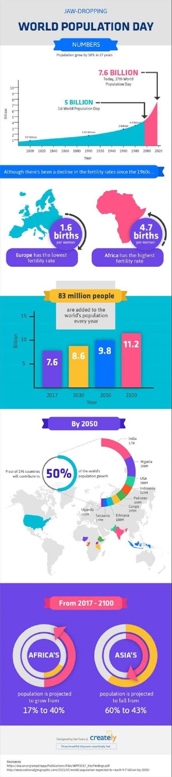
For example take a look at the following infographic example. While it only uses two font types (one for the title and another for the content in the body), it uses a combination of 4 main colors (purple, yellow, blue and pink) throughout the infographic.
At the bottom, it has separate sections for the brand’s logo and the references. The placement of its visual elements and easily readable structure indicates the use of a wireframe prior to the design.
Infographic showcasing all the design elements
Promoting the infographic
Now that you have designed a presentable infographic, it’s time to promote it across the right channels.
Pro tip: Create a separate spreadsheet to track the engagement the infographic generates when you publish it across social media and on external sites and blogs.
Your own site or blog
Publishing on your own blog is important, especially if your infographic marketing campaign is part of generating traffic to your site and increasing your brand’s visibility online. Once you publish it on your site or blog, you can use the page link when you promote it.
Plus make certain that social media buttons are by the side of the infographic so that anyone can quickly share it.
Add the embed code beneath the infographic for anyone who would love to publish it on their own site.
Social media
Facebook, Twitter, Pinterest, LinkedIn, Google+, Imgur, Tumblr, etc. are great platforms to share your infographics on.
Each channel has its own way of optimizing a post (i.e. using hashtags on Twitter or an eye-catching image of the infographic on Facebook), and if need be, you can go for paid promotion as well.
Plus you can share them on communities or pages of these platforms.
And you can personally reach out to influencers in the field, and ask them to retweet your tweet or share your infographic on Facebook.
Free infographic directories
Medium, Buzzfeed, Quora, Reddit, and Visually are platforms where you can get your infographic (along with a brief description, if needed) published.
Remember to always link back to the original page where the infographic is published when you share it across these sites.
Guest blog contributions
This might be time-consuming, but done right, it could be totally rewarding. It can generate traffic to your site, increase your page rankings, and create plenty of brand exposure.
As with any other guest posting strategy, you should have a plan here.
- List down the blogs or sites that accept guest posts or infographic contributions that are relevant to the subject of your infographic
- Go through their guidelines thoroughly
- Reach out to them expressing your desire to get your infographic featured on their site
The more blogs or sites you get your infographic shared on, the more recognition your brand will get.
Final word
Promoted via the right channels, any informative and high-quality infographic that’s based on proper research will continue to generate traffic to your site throughout time.
What is more important is that you select the right sources through which you can reach out to your target audience.
This is how any infographic marketing campaign would generate true positive results for your business.
Amanda Athuraliya is the communication specialist/content writer at Cinergix, the team behind the development of Creately Flowchart Software. She is an avid reader, a budding writer and a passionate researcher who loves to write about all kinds of topics.