
Most people aren’t getting return visitors. Do you know why? Because of not willing to optimize user experience.
Oh, really?
Do you know how people are using your website?
Do you know what menu categories they are drawn to?
Do you know where they click on the home page or on inner pages?![]()
Do you know your most popular pages overall, as well as your entry and exit pages?
Most likely, you don’t.
Despite the fact that over 70% of people who visit our websites will be doing so for the first time, we rarely consider these things.
We’re too close to our website. We know the ins and outs. We can’t think from the perspective of someone arriving for the first time.
But that’s EXACTLY what we should be doing, as these things are fundamental to the user experience, and optimizing the user experience leads to more time on the site, more pages per visit, a lower bounce rate, and more returning visitors.
And all of these things mean more revenue.
In this tutorial I am going to show you
- User Navigation
- User Experience
- Conclusion And Resources
How To Install A Heat Map
There’s a few different ways to go about this. Several different companies and plugins that offer this service. I tried a few and in each and every case I kept coming back to Crazy Egg, Neil Patel’s company, which Pat Flynn used to redesign his website.
CrazyEgg has a variety of plans depending on how much you want to track, but they also offer a 30 day free service, which is what I used for all of the below. I found the free service to be very generous. It allows you to create up to 10 different snapshots and track 10,000 visits over the span of 30 days.
Now, the more data points the better, but in my experience with even a few hundred clicks or less, you can get a good idea of some major pitfalls in your website.
The actual steps to installation are quite simple.
- Create an account
- Download the free plugin “Crazyegg-Heatmap-Tracking”, just by searching in plugins via your dashboard
- Go to settings, find your Crazy Egg plugin, and input your account number.
- Log into the Dashboard and click the yellow button “ADD NEW SNAPSHOT”.
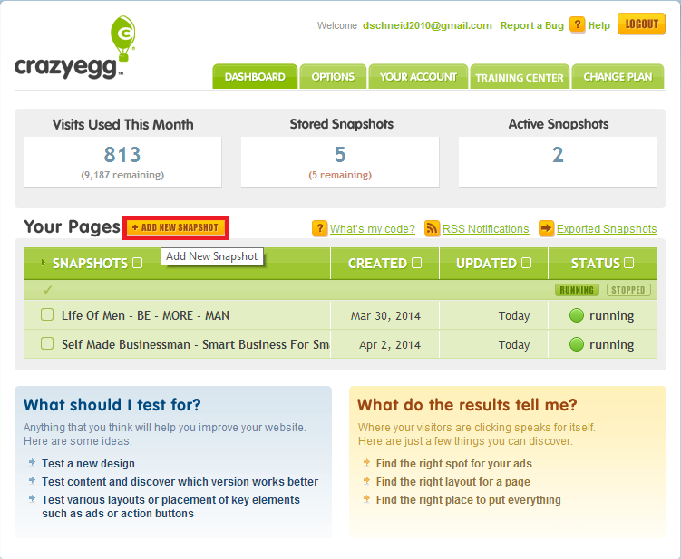
- Input the URL of the page you want to track
That’s it!
In about 24 hours you’ll be tracking your website. If you run into any problems (like I did on step 3) then email [email protected].
Collecting And Interpreting The Results
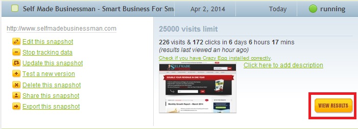
Viewing the results is very easy. You simply click on the snapshot you are interested in, and then go to view results, the yellow button on the side.
The great thing about collecting the results is that even if your website does not get a ton of visitors, you can probably get the data you need within a week. This will allow you to do up to 4 iterations on just the free trial of one single page.
That is, you can track a page, then after a week make some modifications, then start a new tracking (while saving the old), and see how that affects the visitor experience.
You can compare these side by side to see how your changes influence user behavior.
Let’s take a look at a few case studies here.
Hacking Life Of Men
Here is what the heatmap looks like for our men’s magazine Life Of Men. It’s been running for 9 days, seen 329 visits, and 239 clicks. Remember, not everyone who goes to your website goes to the home page, so if you think you are getting more visitors, that is probably why. Also, a “hotter color” like yellow or orange indicates a more active click zone.
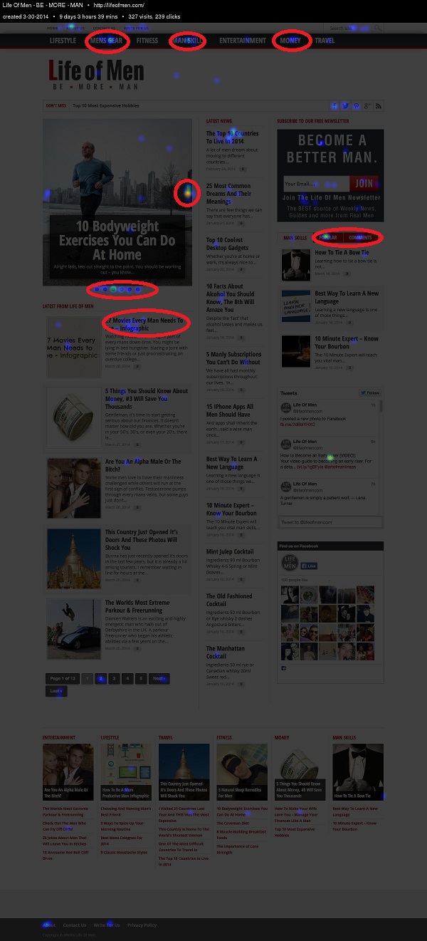
Now it’s important to realize a few things before we dive in and start analyzing. First, you want to be careful to not analyze your own click behavior, since you might act differently than your visitors. Just be conscience of it is all – you can’t avoid clicking on your own website.
Most importantly though is to realize that Crazyegg takes a snapshot of the website on the day you input the URL, and then tracks the clicks. This means that although the website is changing and articles are shifting around, you are only see the clicks as they are coordinates on the website.
Needless to say, after 9 days of tracking, Life Of Men doesn’t look exactly like this and you have to be aware and not make incorrect conclusions like “oh, everyone must have loved this article” when really the conclusion should be “oh, everyone tends to click on the highest article”.
Generally, I give more weight to static features of my website since I feel like the conclusions are stronger.
I highlighted a few things in red that I wanted to call out.
- Menus – Probably the first thing I look at is the menu – what categories are people looking at? In this case it is Men’s Gear, Man Skills, and Money, in that order. This is interesting, because we have been primarily writing about Lifestyle, Travel, and Entertainment. This shows that we not giving our audience what they want.
- Pages – You can see at the top there is some heavy clicking on the About Us and the Write For Us section. You will see it is no coincidence, that the About Me is the most often clicked page on a website, which is why it deserves extra attention.
- Featured Box – The feature box is clearly getting a lot of attention and people are actively scrolling through it. This tells us that we should pay particular attention to what goes in there and make sure it’s some of out best work.
- Popular and Commented – On the right we have an ajax widget where people can see our most popular and most comments posts, which they are using. Its clear that people want to know what are the “best” articles, by popular opinion.
- What Isn’t Clicked? – Just as important as what is being clicked is what is not being clicked. Consider on the sidebar the Twitter widget and the Pinterest widget that almost no one is interacting with. This is prime real estate – What else could go there that would be more engaging?
My next step would be to take these results, make changes to the website and our writing style, and then revisit the heat map to see if that improves things.
Hacking Self Made Businessman
How about another example?
Here is one from Self Made Businessman which I ran for about 3 days and it got over 300 clicks. Again I have highlighted a few things for reference.
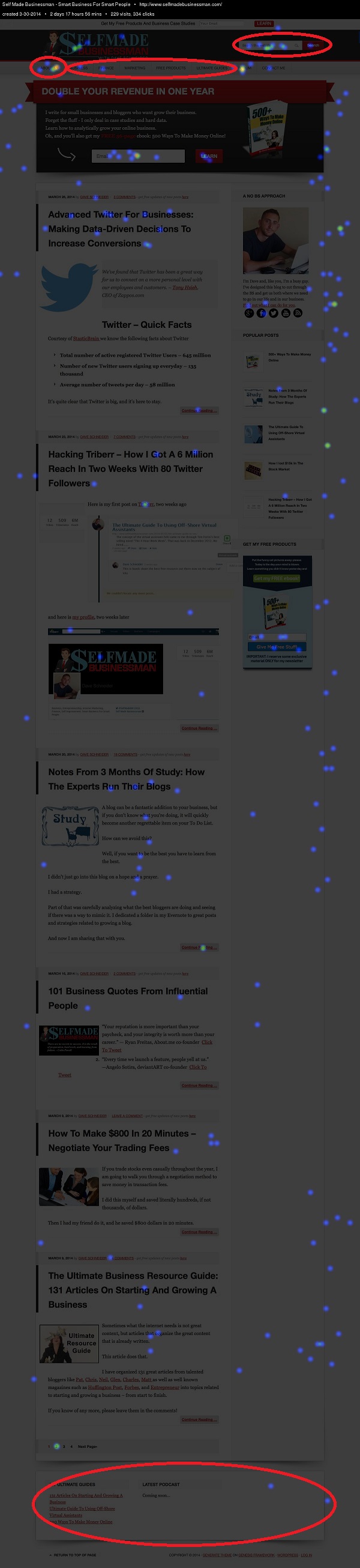
One thing that really struck me was how ACTIVE the search was but how DEAD the menu was. I had categories for Business, Finance, Marketing, and Ultimate Products and no one was clicking. I don’t believe that people all of the sudden stopped using menus. More likely was that the titles were not appealing to them or they didn’t signal to them that this is where they should go.
So I changed it up a bit to be a little bit more intuitive, by making Finance “Make More Money” and Marketing “Get More Traffic”.
I also moved Free Products to the far left because I know that is a hot spot and I want to draw attention to that category. Here is how my menu looks now.

However there is still too much guess work in it. I needed to know what people were searching so I am working on changing my search to a Google Custom search so I can sync it to my Google Analytics and find out. Or you can simply alter your internal site search. This will help me not only design my menu better but also see where there are gaps in my content that I need to fill.
Additionally I saw that no one was interacting with the footer, so I’ve removed it until I figure out what, if anything, I can engage people with there.
The popular posts widget is not getting the attraction I feel like it deserves, so I am going to be replacing those with custom images that have the title overlay, sort of what Brian does on backlinko, to see if that increases engagement.
Hacking Avocado Pesto
Let’s take a look at an inner page this time.
This is from Avocado Pesto, my girlfriend’s food blog which gets between 40k-60k visitors a month so it has nice traffic to draw conclusions from. I just did a COMPLETE redesign and marketing strategy for this website so it now looks very different, but that is going to be for a later, even more epic article.
I chose her most popular page, which is Raw Vegan Collard Wraps.
For now, we’ll just stick to the heat maps and Google Analytics! this ran for 11 days and got over 600 clicks.
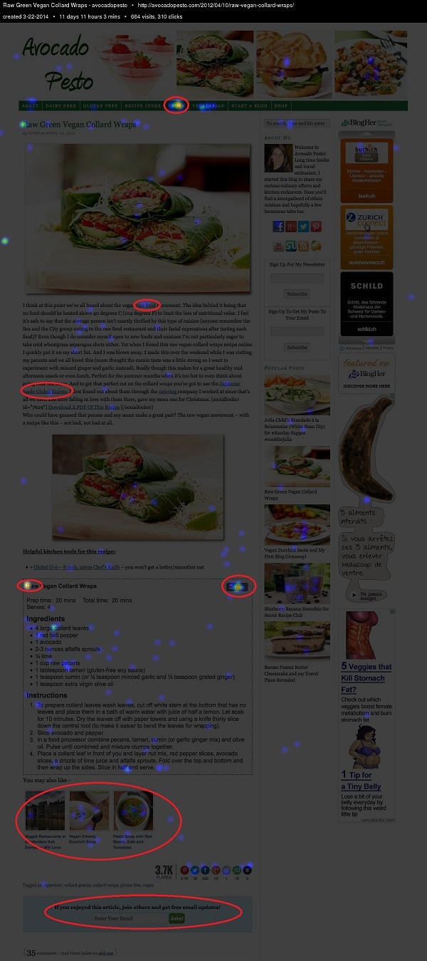
One thing that hit me on the head right away was how active the vegan category was in the menu compared to the other categories.
I didn’t include it here, but I could tell from contrasting this with the home page that this audience was much more vegan oriented.
This makes sense, because it’s a vegan dish and a lot of people come from the search engines who are vegan, of course.
This was further corroborated by considering the related posts widget at the bottom, which shows the only vegan recipe being clicked quite a bit more.
It was clear that the people who landed on this page wanted more vegan recipes, but weren’t getting them in an easily accessible way.
Here’s what I would change (/am changing).
- In conjunction with the fact that no one was touching the newsletter sign up at the bottom, I see an opportunity to come up with a vegan specific offer (like a short ebook for example). This also fits nicely because a lot of people were clicking the “Print” button, so they clearly want vegan recipes that they can save for later use.
- I can include better internal linking within the content itself to highlight more vegan recipes. Additionally, I’ll be sure to send them to some of her best ones, so people see not one but at least two of her best pieces of content in one experience. This is how you really convince people to come back for more. I know personally, that when I see one piece of awesome content, I’m intrigued, but if I see two in a two from the same website, I’ll probably sign up for the newsletter.
- I can make a custom sidebar for this page and other high traffic pages to showcase more vegan recipes on this page.
- I’ll add my own custom thumbnails at the bottom for what I consider to be “related pages” since the plugin isn’t doing a very good job.
All of this will keep these users (who have an 85% bounce rate) looking for more vegan recipes on the website and coming back for more!
Using Google Analytics To Improve User Experience
Heat maps are great, but there is still a lot they can’t do. For example, they don’t scale across your entire website, nor do they really give you the hard data from months or years of tracking.
That’s where Google Analytics comes in. Even without customizing it there is a lot of detailed information that most of us overlook when we’re checking our pageviews five times a day.
Let’s continue with our Avocado Pesto example and dive into the analytics to see what else we can find around user experience.
Your Highest Traffic Pages
It’s important to know what your highest traffic pages are to identify where the new users are coming in for the first time.
If something is a high traffic page over the course of six months, it probably has a constant traffic stream coming in from search or some sort of referral like Pinterest. This means it’s going to be heavily biased to new users, since repeat visitors do not often visit the same page over and over again.
These are the pages you are going to want to focus on for optimization/customization with special offers, heat maps, and more. Avocado Pesto for example, has over 500 recipes. We cannot customize every single page, we have to use the 80/20 rule to get the most out of our time.
Here is how you get to the highest traffic pages.
- Go to Google Analytics.
- Go to Behavior > Site Content > All Pages
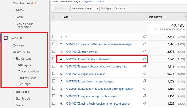
It’s good to focus on content that was published months or even years ago as those are the ones that are standing the test of time. Another way to get around this is to increase your time frame from one month to several months or a year even. If something is consistently ranking, it’s a winner.
You can easily increase the number of rows from 10 to 1000 if you really need it all (though that wouldn’t be much of an 80/20 rule) or export it to excel, all from within Google Analytics. From there, for example, you could sort and find the most popular pages from /2012/, depending on your permalink structure.
You can see number 4 (the first is the home page) is the raw vegan article we looked at earlier. It’s over two years old, but still ranks in the top!
Additionally, in that same category, you can check out landing pages and exit pages.
Between the three of these you will easily have an idea of what pages you need to focus on.
Your Most Popular Categories
I like to look at most popular categories, because it provides insight into my customer profile. This encompasses all sorts of behavior such as menu clicks, search bar (on website) activity, search engine activity and more!
What are they looking for when they come to my site?
The individual article view is too granular to get this information, you need to be at a bit of a higher level.
Here is how you get to the most popular category pages.
- Go to Google Analytics.
- Go to Behavior > Site Content > Content Drilldown
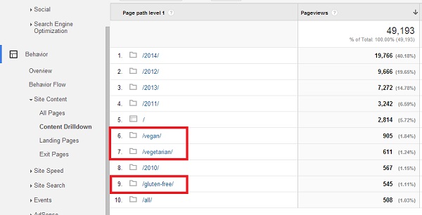
In this case I have highlighted Vegan, Vegetarian, and Gluten-Free, since the others are years and don’t really provide any value except to say that the website was getting more traffic in 2014 than in 2013.
So now I know that people who come to Avocado Pesto are primarily interested in recipes targeted at people with restrictive diets.
I could use this this information to cater the frequency at which I write certain recipes. Or, if I have a popular category that is not displayed in the menu, I could put it there.
For example, on AvocadoPesto, we saw that some of the most popular categories were Vegan, Vegetarian, Gluten Free, and Dairy Free but also Breakfast, Lunch, Dinner, and Dessert so we decided to combine these into one menu with drop downs, for example
- Vegan
- Vegan Breakfast
- Vegan Lunch
- Vegan Dinner
- Vegan Dessert
Analyzing The Behavior Flow Of A Specific Page
When I’m optimizing around a single page I want to know where users are going from that page. I can do this very easily with the behavior flow tool.
Here is how you get to the behavior flow for a single page.
- Go to Google Analytics.
- Go to Behavior > Behavior Flow
- On that page you will see your landing pages in order of traffic, click one and then do “View only this segment”
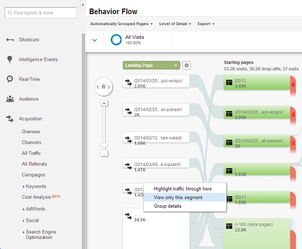
I selected the Raw Vegan Collard Wraps page again. See below:
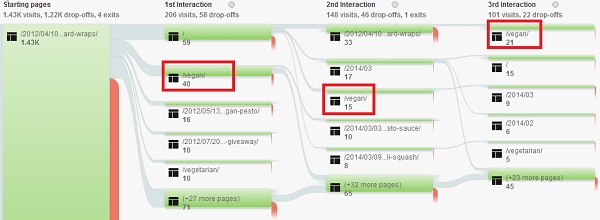 Now I can see where those users are going on their first, second, and third interaction. Notice how many people are ending up in the Vegan category at some point or another?
This is very consistent with the heat map view, as it should be, it just allows for a different way of looking at things.
This page has an 85% drop off rate – something needs to be fixed, and I now have the user data to know exactly what I need to give them to get them to stay.
Optimizing For User Experience
Alright so we’ve made a lot of progress. We know who our customer avatar is and what are the hot spots they are going to. We also know what they are doing on those pages and we can make some inferences as to why it might be the case.
However, we still don’t have the complete picture as to what is driving our user’s actions.
For example, nothing from the above can tell us whether or not a visitor just didn’t like the content itself.
Or maybe the site was too slow.
Optimize User Readability
I had a chat with one of my readers the other day, and he mentioned that he really liked the style of my writing. He mentioned he was dyslexic and he found my articles easy to read.
Honestly, I had never considered this segment of my audience before.
Bottom line – readability matters. If your writing is difficult to read, containing long sentences, many polysyllabic words, and has zero spacing, you’re going to find people jumping off your page (or missing the good stuff like internal linking).
Luckily there are quick tests for this, such as WordsCount or Read-Able.
Just put in your text and let it populate. Here are the results for the Raw Vegan post.
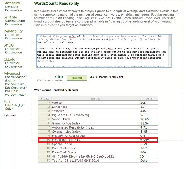
I like when I can sum it up into an easy to understand, accepted metric, such as The Flesch Reading Ease Score, which I highlighted above.
Scores between 60 and 70 are considered normal for any literate person.
Run this on each of your most trafficked pages to make sure they are of acceptable reading quality.
A similar but slightly more “fun” approach is the Hemingway App, a free marketing too online that will highlight dense passages, sentences that are hard to read, and words that could be changed or made simpler.
One way to think about this is WordsCount tells you if it’s hard to read, and Hemingway tells you why and where (though, Hemingway tells you the if part too, just without the Flesch Score).
Additionally, if you think there might be coloring issues, you can run your URL through a site like CheckMyColors, which will test the contrast of your foreground (text) against its background. The higher the contrast, the more likely your text is legible and pleasant to read.
Optimize Website Speed
A few website speed facts courtesy of KissMetrics
- 47% of consumers expect a web page to load in 2 seconds or less.
- 40% of people abandon a website that takes more than 3 seconds to load.
- A 1 second delay in page response can result in a 7% reduction in conversions.
Speed matters, a lot.
If someone is leaving your website, maybe they just got tired of slow loading times.
As with readability, there are a million tools to use to check the page grade of your website. My favorite is GTMetrix, though Pingdom is also popular..
Here are the results of the Raw Vegan post.
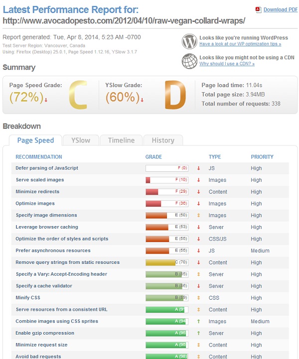
Ouch, looks like some work needs to be done!
The easiest is to go for the “quick wins” whereby you focus on high priority items with the lowest score. In my case, this would be optimizing images.
Optimize Website Functionality
We all tend to access our website in the same way; the same lap top, the same browser, the same pages.
Again, we’re not thinking about how a new visitor might be experiencing our website. Are we aware of how our website looks in different browers? Or on a desktop vs. mobile phone?
Nope.
Optimizing For Mobile Visitors
First you want to know how many people are accessing your site through mobile.
I chuckled a bit when I read in a recent post from ScrewTheNineToFive that they weren’t aware that two of their affiliate sites were getting 80% of their traffic from mobile users…and they didn’t have a responsive theme.
Here’s how you can check how many mobile visitors you’re getting.
- Go to Google Analytics.
- Go to Audience > Mobile > Overview
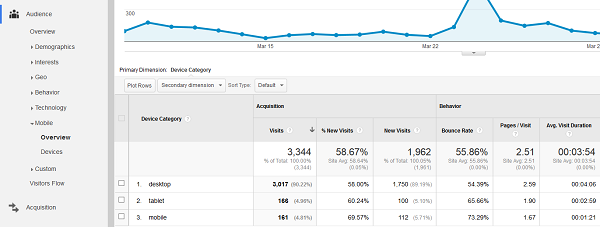
Now you can see the individual metrics for desktop, tablet, and mobile. You can also check the box and click “Plot Rows” to see it on the charge above.
If you move one category down to “Devices” you can actually see the individual mobile devices.
To see how your site looks on a mobile device, well, you could just use your own. Or, if you don’t have one, go to a site like MobileTest.me and you can check it on various devices.
If you have a heavy mobile audience, as many now day, you are going to want to optimize for this, by either getting a responsive design or at a minimum installing the free WPTouch Mobile Plugin, which is what I use for SelfMadeBusinessman.com.
We rarely check our broken links after we’ve published posts. It was working then, so why wouldn’t it be working now?
As it turns out, pages get deleted, or people change domain names, and links get broken.
The result is something not very pleasant for our audience.
To check for broken links, you can go to Broken Link Checker and put in your URL and it will scan your entire website.
Is your site coded correctly?
Poor coding can lead to increased speed times and improper formatting, so it’s good to get it fixed, even if everything looks OK on the front end.
A simple check is to run it through the W3c Markup Validation website and see what it spits out.
I pretty much exclusively access my website in Chrome and Firefox, so I have no idea what it looks like to Safari users or Opera for example.
But I know it looks different.
If I want to see how it looks in each one, the website I prefer to use is Browserling
All of this fancy stuff is nice and it makes us feel like we are doing the right thing, but I will say this:
There is no substitute, NO SUBSTITUTE, for simply asking our readers for their feedback.
If we want to know how to improve our website for our readers, we should ask them.
A simple way to do that is to send out an email to your subscribers.
For example, when Lewis from CloudIncome was redesigning his site he took the following actions
- He created a survey on Survey Monkey
- He emailed it to his subscribers
- He analyzed the results
- He incorporated them into his new design
And this solved a lot of problems.
Now, it’s true that asking for current readers’ advice is not the same as new visitor feedback but there is a lot of overlap.
Conclusion And 5 Amazing Articles + An Infographic
Before you start your next project, or write your article, stop.
Stop and take a minute to user test your website, find out what’s wrong and what’s right. The more these problems persist the more you are fighting against a strong, counter wind and losing potential repeat visitors.
Many of these topics deserve separate articles all unto themselves, so I have included a reference when I feel more attention is deserved. I hand selected these articles as being some of the best on the topics they cover.
- Design – 19 Things We Can Learn From Numerous Heat Map Tests
- Analytics And Tracking – The Ultimate Guide To Google Analytics
- Mobile Optimization – 9 Tips For Optimizing Your Site For Mobile
- Website Performance – The Ultimate Guide To Website Optimization
- User Feedback – The 5 Best Ways To Get Customer Feedback
Additionally, this infographic from QuickSprout gives a nice, visual summary of many of the points I was discussing above:
