
Call To Action is important. Just using them as part of your marketing efforts can bring in up to 55% more traffic.
That said, not all Call To Actions are created equal. Making even minor cosmetic changes to a CTA can lead to a massive gain (or loss) in clickthrough rate.
Luckily, there’s been enough testing going on in the digital landscape that marketers now have a pretty good idea of what works best.
Here is your data-driven guide to creating turbocharged Call To Actions.
Visibility is Key
It might seem like a nobrainer that your CTA needs to be visible, but you’d be surprised what even minor changes in positioning or coloring can do to obscure a CTA.
Here’s an example from RIPT Apparel :
The online retailer had a default buy button that really blended in with the site’s color scheme:

Image via VWO
VWO worked with them to come up with a more visible buy button. They tested a few different versions and decided on this one:

Image via VWO
Which led to a 6.3% increase in sales for the brand.
Pay attention to small details that might affect your CTA’s visibility.
Offer Value
Marketers know that they need to offer value in order to nurture leads. For most, this means integrating a value proposition into their content to encourage clicks.
This is a worthwhile strategy, but many don’t realize they should be inserting that value proposition right into their Call To Action as well.
Check out this example from Costa Rica Airline , Nature Air:
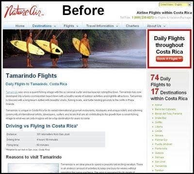
Image via Blastam
They had a prominent CTA, but made one minor change that made a huge impact:

Image via Blastam
There are many places people can go to get daily flights throughout Costa Rica. But for $58? Maybe not.
By showing how they could offer something unique from their competitors, the airline increased their conversion rate by 591%!
Your value proposition doesn’t always have to be about price, but it seems to be an effective strategy. It could be a unique service or special offer. Just make sure it’s prominent in your CTA.
Keep It Simple and Targeted
It might seem like a good idea to put your Call To Action everywhere, so visitors can always find it, but bombarding your audience with CTAs might actually send the wrong signals.
Whirlpool worked with Marketing Sherpa to test the effectiveness of emails with 4 CTAs versus emails sent out with one highly focused CTA. It turned out that putting all their efforts into one very targeted CTA gained them a 42% increase in clicks.
The content you develop is supposed to offer value to your audience and answer their questions but if they get the impression that it’s all about getting them to click, then they might take it with a grain of salt and not click.
Have a Sense of Urgency
A turbocharged Call To Action always gives your audience a reason why they should click now, and not later. Call it a sense of urgency.
Look at the minor changes Marcus Tylor made for his Groupon deal for musicians:

The countdown timer basically implores people to click now or not at all. The sense of urgency earned him a 147% increase in conversions.
Your sense of urgency doesn’t have to be that fancy. Look at what happened when CanaDream RV Rentals and Sales added a few choice words to their CTA:

Screen shot taken 6/02/16 from WiderFunnel
Their RV bookings went up by an impressive 106%.
Above the Fold? Maybe Not.
People don’t read online. Research from Chartbeat found that about 80% of readers view the area just above the fold, but only about 50% make it half way through an article.
So if your CTA is below the fold, no one will see it, and no one will click it, right?
Wrong.
Kissmetrics found several case studies where CTAs had a higher clickthrough rate below the fold.
The reason:
If a reader actually does make it below the fold, chances are your content has captured their interest. And if it’s captured their interest, they’re more likely to click.
So if you need to make a precious decision about where to place your CTA, put it where only the most interested prospects will find it below the fold.
A/B Test… A Lot
Small details can mean a lot. Unbounce tested the color and shape of their CTA button, which helped them improve their CTR by 35.81%. In a different example, they changed one of their CTAs from “Get your free 30day trial” to “Get my 30day trial” and saw a 90% increase in CTR:

Screen shot taken 07/02/16 from Unbounce
And while it’s helpful to learn from the success of others, what works for one brand’s CTA might not for yours. In fact, what works for your CTA now might not work in 6 months, as Aweber found with their CTA A/B testing.
Getting your audience to take action can make or break your content and email campaigns . Visibility, value proposition, and a sense of urgency are a few of the best practices that can help turbocharge almost any CTA.
Keep in mind the points that can help turbocharge any CTA, but remember the most important strategy lies in testing them out with your own audience.
Know any other tips to create turbocharged CTAs? Comment below with your best ideas!